Examples of plotannot annotations
This notebooks presents a few examples of the plotannot package for annotating axis labels.
Getting ready
[1]:
#Load a few packages for plotting
import numpy as np
import pandas as pd
import seaborn as sns
import matplotlib.pyplot as plt
np.random.seed(1) #make notebook reproducible
[2]:
#Load plotannot
import plotannot
[3]:
#Create some fake data
table = pd.DataFrame(np.random.random((100,50)))
table.head()
[3]:
| 0 | 1 | 2 | 3 | 4 | 5 | 6 | 7 | 8 | 9 | ... | 40 | 41 | 42 | 43 | 44 | 45 | 46 | 47 | 48 | 49 | |
|---|---|---|---|---|---|---|---|---|---|---|---|---|---|---|---|---|---|---|---|---|---|
| 0 | 0.417022 | 0.720324 | 0.000114 | 0.302333 | 0.146756 | 0.092339 | 0.186260 | 0.345561 | 0.396767 | 0.538817 | ... | 0.988861 | 0.748166 | 0.280444 | 0.789279 | 0.103226 | 0.447894 | 0.908596 | 0.293614 | 0.287775 | 0.130029 |
| 1 | 0.019367 | 0.678836 | 0.211628 | 0.265547 | 0.491573 | 0.053363 | 0.574118 | 0.146729 | 0.589306 | 0.699758 | ... | 0.114746 | 0.949489 | 0.449912 | 0.578390 | 0.408137 | 0.237027 | 0.903380 | 0.573679 | 0.002870 | 0.617145 |
| 2 | 0.326645 | 0.527058 | 0.885942 | 0.357270 | 0.908535 | 0.623360 | 0.015821 | 0.929437 | 0.690897 | 0.997323 | ... | 0.556240 | 0.136455 | 0.059918 | 0.121343 | 0.044552 | 0.107494 | 0.225709 | 0.712989 | 0.559717 | 0.012556 |
| 3 | 0.071974 | 0.967276 | 0.568100 | 0.203293 | 0.252326 | 0.743826 | 0.195429 | 0.581359 | 0.970020 | 0.846829 | ... | 0.263297 | 0.065961 | 0.735066 | 0.772178 | 0.907816 | 0.931972 | 0.013952 | 0.234362 | 0.616778 | 0.949016 |
| 4 | 0.950176 | 0.556653 | 0.915606 | 0.641566 | 0.390008 | 0.485991 | 0.604310 | 0.549548 | 0.926181 | 0.918733 | ... | 0.315245 | 0.892889 | 0.577857 | 0.184010 | 0.787929 | 0.612031 | 0.053909 | 0.420194 | 0.679069 | 0.918602 |
5 rows × 50 columns
[4]:
#Prepare some english words to use for labels
import english_words
words = sorted(list(english_words.english_words_lower_set))
rand_integers = np.random.randint(0, len(words), size=100)
words = [words[i] for i in rand_integers] #100 random words
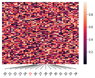
Simple example
[5]:
#Plot heatmap
ax = sns.heatmap(table, xticklabels=True, yticklabels=False)

#Rotate all labels
plotannot.format_ticklabels(ax, axis="xaxis", rotation=45)

#Annotate labels
to_label = range(20,35)
plotannot.annotate_ticks(ax, axis="xaxis", labels=to_label)

#Color individual labels
plotannot.format_ticklabels(ax, axis="xaxis", labels=[25], color="red")

plt.savefig("simple_example.png", bbox_inches="tight", facecolor='white')
Annotate axis of scatter plots
[6]:
fig, ax = plt.subplots()
ax.scatter(words, range(len(words)))

#First rotate to make labels fit
plotannot.format_ticklabels(ax, axis="xaxis", rotation=90)

#Annotate labels
to_label = [words[i] for i in range(20,35)]
plotannot.annotate_ticks(ax, axis="xaxis", labels=to_label, rel_label_size=2) #rel_label_size gives a bit better space for the labels

#Finally, rotate labels to be more visible
plotannot.format_ticklabels(ax, axis="xaxis", rotation=30, ha="right")
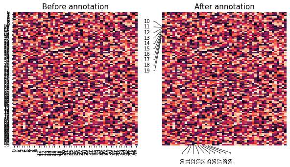
Annotate x- and/or y-axis ticks
[7]:
#Plot data with labels
fig, (ax1, ax2) = plt.subplots(1,2, figsize=(10,5))
sns.heatmap(table, yticklabels=True, xticklabels=True, cbar=False, ax=ax1)
sns.heatmap(table, yticklabels=True, xticklabels=True, cbar=False, ax=ax2)

#Apply annotation to second axes
to_label = range(10,20)
plotannot.annotate_ticks(ax2, axis="xaxis", labels=to_label)
plotannot.annotate_ticks(ax2, axis="yaxis", labels=to_label)

#Label axes
_ = ax1.set_title("Before annotation", size=15)
_ = ax2.set_title("After annotation", size=15)

plt.savefig("before_after.png", bbox_inches="tight", facecolor='white')
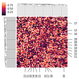
The function annotate_ticks also works directly on seaborn objects such as the ClusterGrid of sns.clustermap:
[8]:
g = sns.clustermap(table, yticklabels=True, xticklabels=True, figsize=(4,4))

to_label = range(10,20)
plotannot.annotate_ticks(g, axis="xaxis", labels=to_label)
plotannot.annotate_ticks(g, axis="yaxis", labels=to_label)
Choose specific labels for bottom/top and left/right axes
[9]:
#Plot data and turn on all labels on
ax = sns.heatmap(table, yticklabels=True, xticklabels=True, cbar=False)
ax.tick_params(right=True, top=True, left=True, bottom=True,
               labelleft=True, labelbottom=True, labelright=True, labeltop=True)

#Apply annotation for each axis
left_labels = range(10)
plotannot.annotate_ticks(ax, axis="left", labels=left_labels)

right_labels = range(90,100)
plotannot.annotate_ticks(ax, axis="right", labels=right_labels)

bottom_labels = range(10,16)
plotannot.annotate_ticks(ax, axis="bottom", labels=bottom_labels)

top_labels = range(23,30)
plotannot.annotate_ticks(ax, axis="top", labels=top_labels)

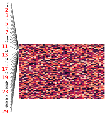
Highlight specific rows with color, size and annotation
[10]:
ax = sns.heatmap(table, xticklabels=False, yticklabels=True, cbar=False)

#Color a subset of labels
to_format = [2,3,5,7,11,13,17,19,23,29]
plotannot.format_ticklabels(ax, "yaxis", labels=to_format, color="red", fontsize=20)

#Annotate all ticks
plotannot.annotate_ticks(ax, "yaxis", labels=range(0,30), expand_axis=1, perp_shift=10)
Highlight and rotate labels
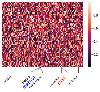
[11]:
#Plot data
word_table = pd.DataFrame(np.random.random((50,100)), columns=words)
ax = sns.heatmap(word_table, yticklabels=False, xticklabels=True)

#Label specific words
plotannot.format_ticklabels(ax, "xaxis", labels=["mail"], color="red", format_ticks=True, fontsize=16)
plotannot.format_ticklabels(ax, "xaxis", labels=["methyl"], color="blue", format_ticks=True, fontsize=16)

#Annotate ticks starting with "m"
m_words = [word for word in words if word.startswith("m")]
plotannot.annotate_ticks(ax, "xaxis", labels=m_words, rel_label_size=1.5)

#Rotate all ticklabels to 45 degrees
plotannot.format_ticklabels(ax, "xaxis", rotation=45, ha="right")